Splash Screens
Overview
A splash screen is a placeholder that covers a page while its content is not ready for work yet — for example, while a device is connecting or data is loading. Unlike a traditional startup splash window, it is a regular control: the application places it in XAML on top of the page content and shows it until the page becomes usable.
Asv.Avalonia provides two splash screen controls:
AwaitingScreenrepresents a passive waiting state: the page becomes available when a background process completes — for example, a device finishes connecting. It shows a header, a description, a pulsing icon, and an indeterminate progress bar.ActionScreenrepresents a state that requires a user action: the whole screen is a single button bound to a command. While the command runs, the button is disabled and an indeterminate progress bar is shown.
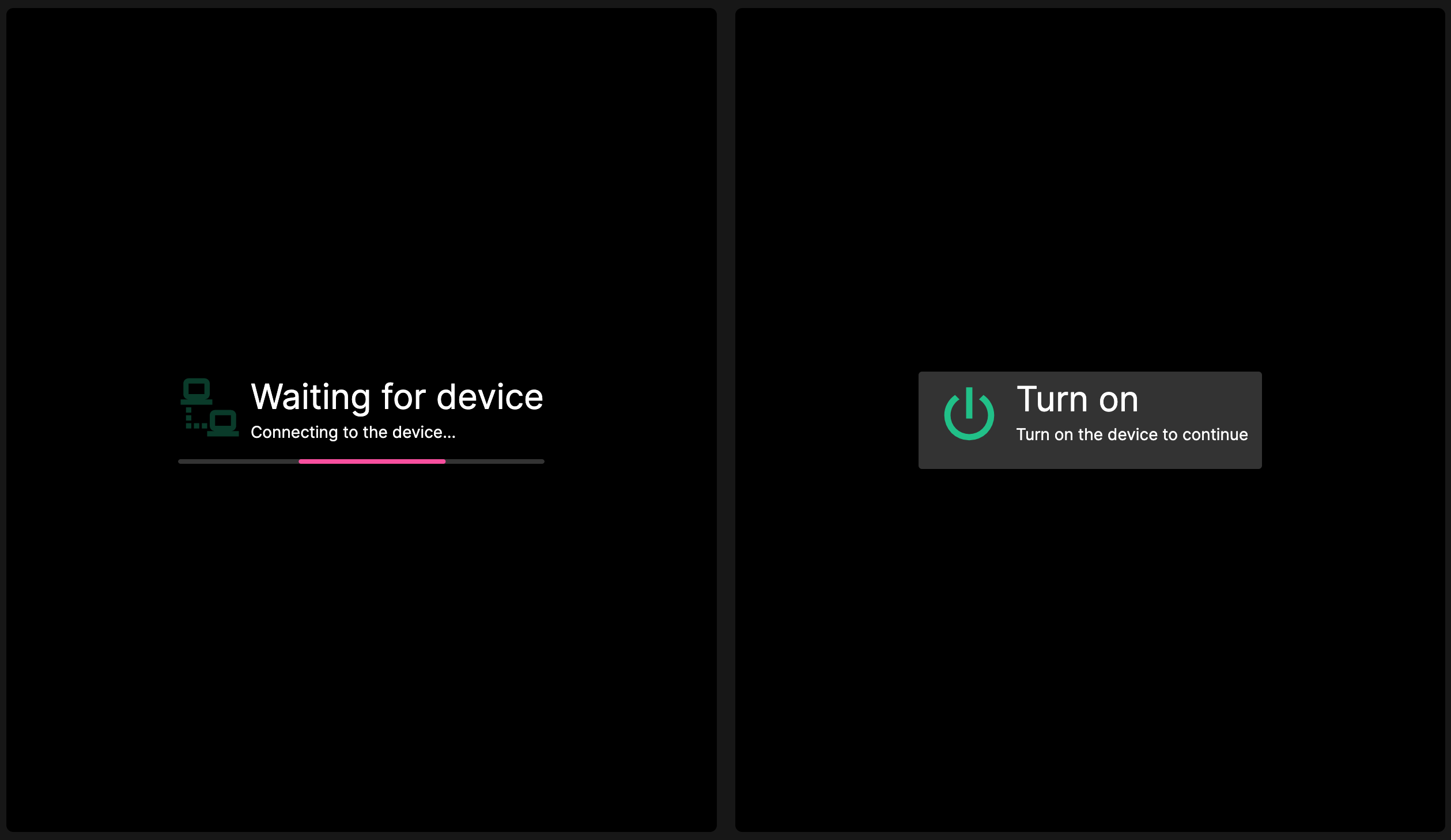
The controls do not manage their own visibility and do not require a view model. The application shows and hides them through IsVisible. Styles for both controls are part of the Asv.Avalonia theme, so no additional registration is required.
Usage
Place AwaitingScreen on top of the page content and hide it when the page is ready:
Hide the underlying content with an inverted binding, as in the example above, so that only one layer is visible at a time.
Use ActionScreen when the page needs the user to start an operation:
While IsExecuting is true, the button is disabled, so a long-running command cannot be started twice.
API
AwaitingScreen
Represents a screen that indicates a passive waiting state with a pulsing icon and an indeterminate progress bar.
Property | Type | Description |
|---|---|---|
|
| Gets or sets the header text. |
|
| Gets or sets the description text shown below the header. |
|
| Gets or sets the icon. Defaults to |
ActionScreen
Represents a screen that renders a single button that starts an application-provided command.
Property | Type | Description |
|---|---|---|
|
| Gets or sets the header text. |
|
| Gets or sets the description text shown below the header. |
|
| Gets or sets the icon. Defaults to |
|
| Gets or sets the command executed when the button is pressed. |
|
| Gets or sets the parameter passed to |
|
| Gets or sets a value indicating whether the command is running. While |